branding design
Chitose Japanese Restaurant — Brand Identity & Creative Direction
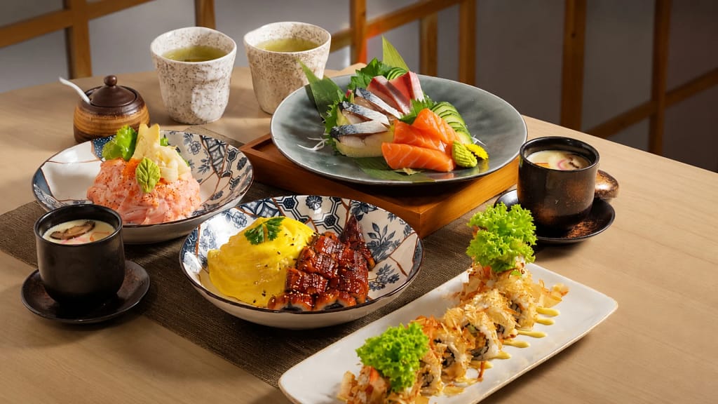
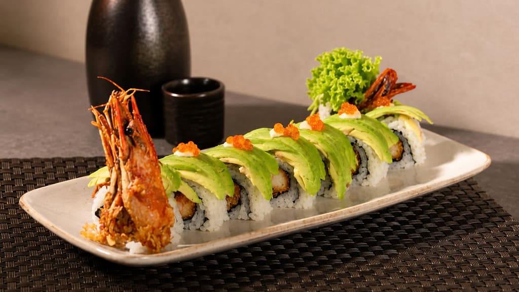
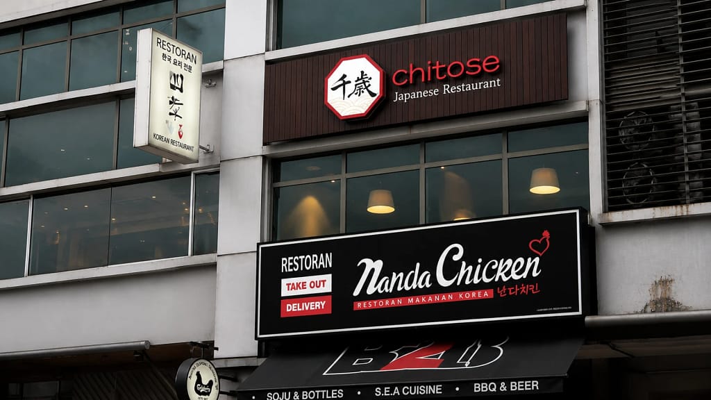
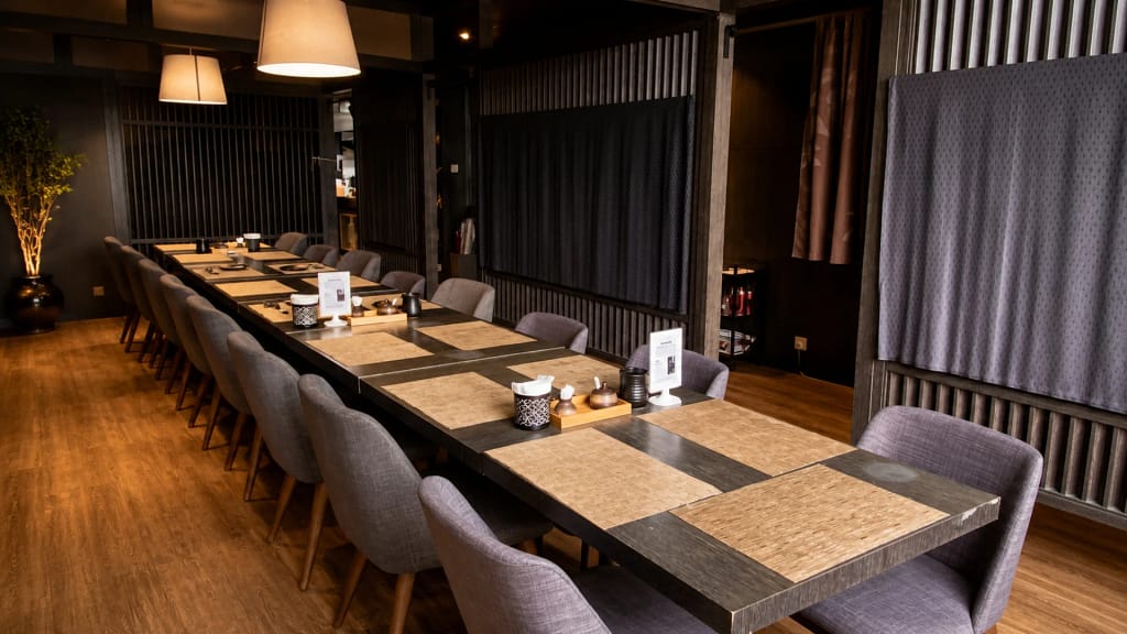
Chitose Japanese Restaurant Logo Description Chitose Japanese Restaurant Signage Food photography courtesy of Chitose Japanese Restaurant Some restaurant...
Year
2017
Country / Location
Kuala Lumpur, Malaysia
Role
Branding Designer
Scope of Work
Brand Identity Design, Menu Design
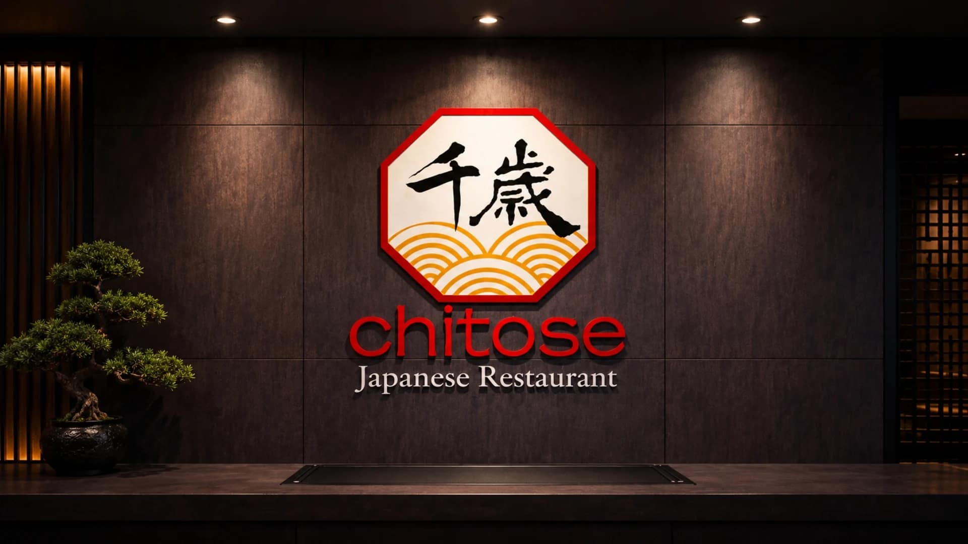
Some restaurant projects begin with food. This one began with discipline.
When Chitose Japanese Restaurant approached me, the goal wasn’t simply to design a logo. The restaurant already had something far more important — a Japanese chef deeply committed to authenticity, quality control, and the quiet precision that defines traditional Japanese dining culture. The challenge was translating that philosophy into a complete visual identity system that felt equally refined, respectful, and timeless.
The Name
“Chitose” (千歲) translates to “a thousand years” in Japanese — a name traditionally associated with longevity, prosperity, and enduring hospitality. From the beginning, the identity needed to carry that sense of permanence: not trend-driven, not overly decorative, but calm, confident, and rooted in heritage.
The Logo Concept
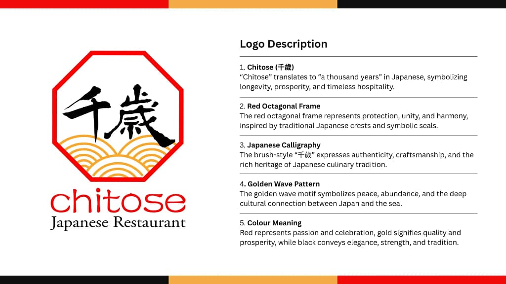
The logo was designed around several symbolic elements working together as a unified identity system.
At the centre sits the Japanese calligraphy “千歲”, rendered in a brush-style expression that reflects craftsmanship, authenticity, and the cultural heritage behind Japanese cuisine. Rather than appearing overly modernised, the calligraphy preserves the warmth and imperfection associated with traditional Japanese ink writing.
Surrounding it is a red octagonal frame inspired by traditional Japanese crests and ceremonial seals. The octagonal form symbolises harmony, protection, and unity — framing the restaurant identity with a sense of structure and balance.
Beneath the typography, the golden wave motif references Japan’s historical relationship with the sea, symbolising peace, abundance, and continuity. The flowing line work also softens the overall composition, preventing the identity from feeling too rigid or corporate.
The colour palette was intentionally restrained:
— Red for passion, celebration, and hospitality
— Gold for prosperity, refinement, and premium quality
— Black for elegance, strength, and timelessness
Creative Direction Beyond the Logo
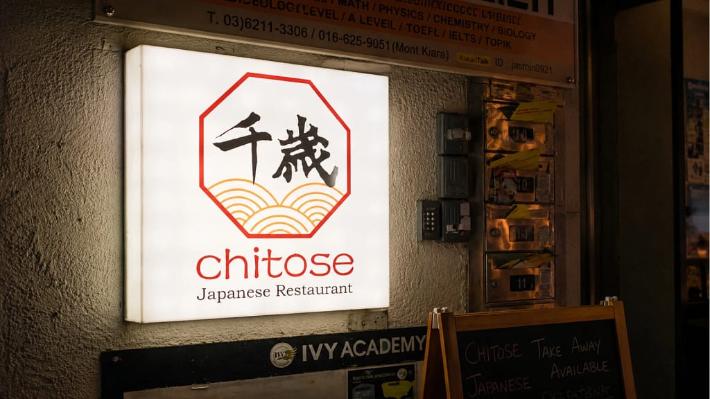
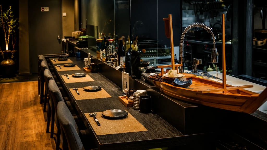
What made this project meaningful was that the branding did not stop at the logo itself. The identity system extended across every customer touchpoint to ensure consistency and atmosphere throughout the restaurant experience.
The creative direction covered:
— Exterior signboard design
— Japanese noren curtain applications
— Menu layout system
— Name cards and corporate stationery
— Bowl and chopstick packaging
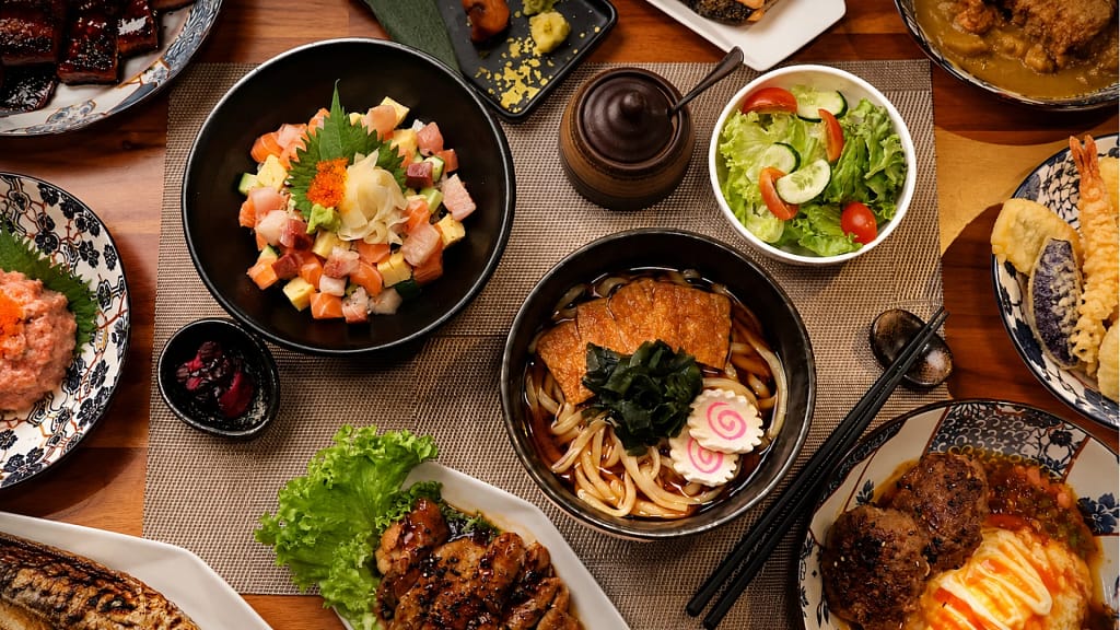
— Food presentation styling
— Food photography direction
— Brand visual consistency across print and digital materials
Every detail was approached with the same philosophy the chef brought into the kitchen: precision, restraint, and quality control.
Rather than forcing the restaurant into a contemporary “Instagram aesthetic,” the direction focused on creating something more lasting — a visual identity that feels culturally grounded, trustworthy, and quietly premium.
The Result
The final identity system establishes Chitose as a refined Japanese dining brand with strong visual consistency across physical and digital touchpoints. More importantly, it reflects the spirit of the restaurant itself: authentic Japanese hospitality presented with care, discipline, and timeless simplicity.
Brand Identity & Creative Direction by Serah Siew